

Hand screen printed art, textiles, & Digital Prints
It all started when…
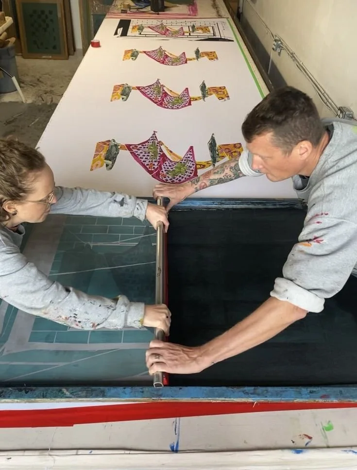
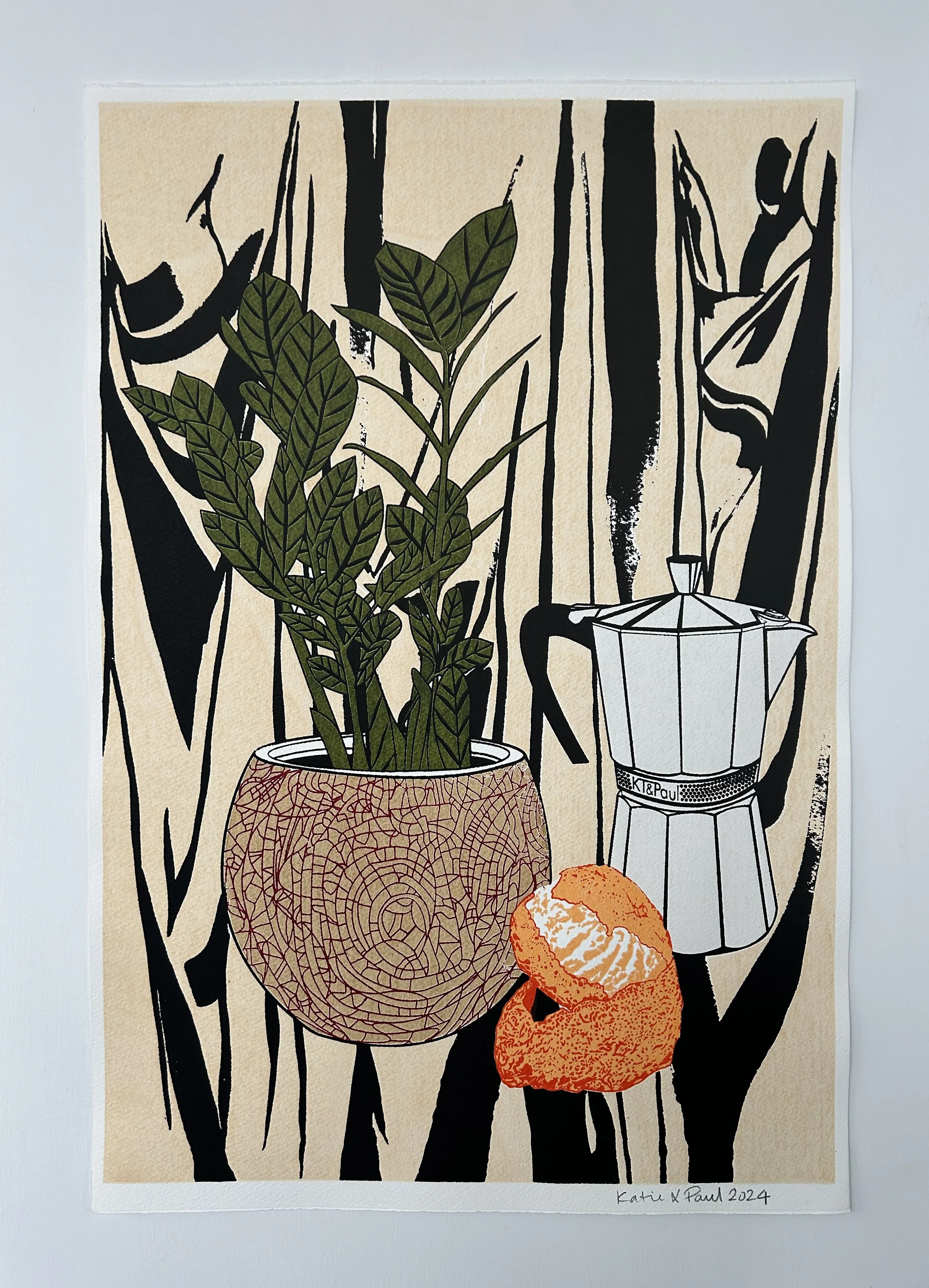
Katie & Paul met at Middlesex University London U.K. in 1998. They graduated with a degree in printed textiles and surface decoration. They have been making art, screen printing together ever since. A love of colour, lines ,shape and pattern run through their work. They have exhibited In New York, London and Vancouver, where they currently reside.


Come find us at granville island public market
〰️
Come find us at granville island public market 〰️
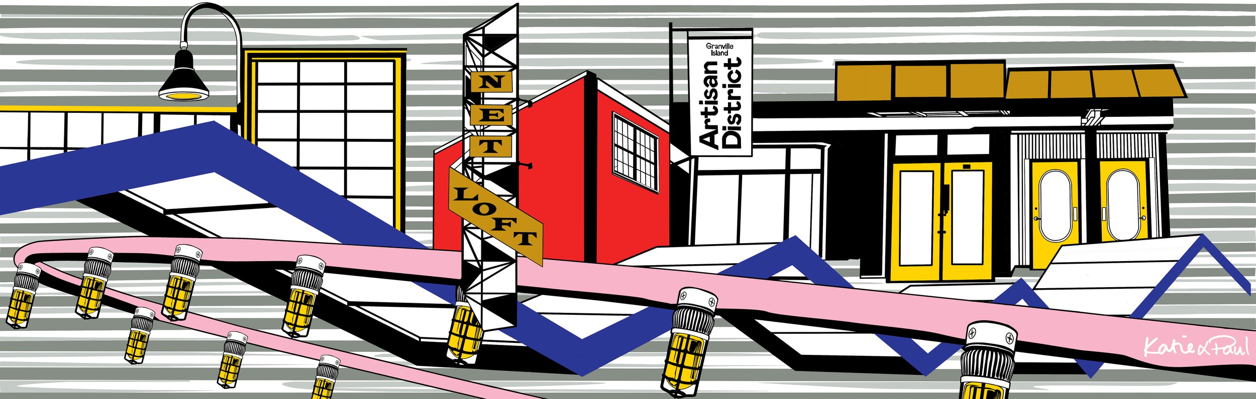
Market Dates
Dec 11th - 14th 10 am - 6 pm